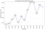
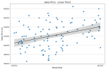
Fannie Mae has provided an illustration but no information is given on:
- Quantity of data or statistical sample
- Area (subdivision, city, 1 mile radius etc.) it was taken from
- Quality of data (did it only consist of properties comparable to the subject)
In reference to my original illustration, comparable properties in half mile radius of the subject sold in 12 months were less than 10. Any inference from this statistical sample would be useless.
View attachment 98983
I love the illustration!
I will give the GSEs credit where credit is due. The only issue was that it was poorly worded and it freaked people out.
I took it differently. To me it said that appraisers can now make non linear market condition adjustments.
Let's be honest here. A good portion of appraisers were not even making market condition adjustments. The other portion were only making straigh line linear adjustments.
I have never seen a appraiser make non linear adjustments.....never.
I appraise in a seasonal market, so I love the example and it allows me to make non linear adjustments without getting push back from uws....I just copy and paste the graph from fannie
As others noted, if you don't have the data, you don't have the data. Simple as that.
As always, appraisers freaked out over nothing.
Try out aloft, zillow, or Sam in the MLS. Aloft, zillow and Sam in the MLS has month to month data. In Sam, just hoover over for the data point.
If you use alamode, try importing 7-20 that close 0-365 time period sales in the smart adjust, make all of your adjustments except for time adjustments and don't use sensitivity analysis. This is data from within the market area. The adjusted sales should indicate what the market is doing. Screen shot that and put it in your report.


