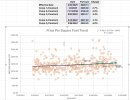
• Welcome to AppraisersForum.com, the premier online  community for the discussion of real estate appraisal. Register a free account to be able to post and unlock additional forums and features.

This is a pretty niffty detailed chart for finding time adjustments, we are done.

Check out this new AI spreadsheet tool. A bit like Google Sheets insofar as it's a web based application, but it has a built in AI assistant. Has a free version, but with very limited AI requests. $8 a month gets you unlimited AI requests. For the chart below, I uploaded a spreadsheet with Date and Price, then asked AI to graph date against price using date as the horizontal axis. Then I asked AI to fit the regression equation over the other series (this tool can't add a trendline like Excel can). Anyway - pretty nifty and could really lower the learning curve for learning Excel type applications.

View attachment 101613

Sorry - forgot to add the application: www.rows.com
Pretty cool. Thanks for sharing
 
Beginning in February 2025, appraisers will be required to provide support for time value adjustments for comparable sales (comps) and market conditions—and also include an illustration of the methodology used.

If we can have a program that says and does this and puts in the numbers, life gets easier. If you have to figure out yourself all this and write it, no extra pay for extra time spent. Also, this is showing you that fannie has the program to burn you. And of course, their avm will have this. Another domino falls to end of appraisers.

View attachment 94533
 
In Bert's county which is the 2nd wealthiest county in CA, the assessor came out with % growth of the assessed value of each city in the county.
Many cities increased at different % like 7%, 6%, etc.
Since assessor has mass data to work with, I was thinking, which I wouldn't but could, use those % as justification to do time adjustments.
Market conditions always difficult and best to avoid but when GSE wants it, I'm creative in getting my adjustments.
 
Some of you are lacking understanding of non linear/linear time lines. I have yearly linear city including metro area, county yearly market, zip code yearly market, listing yearly market.
I do a neighborhood year time line and a competing market time line. When it's a constant up/down trend, then a linear adjustment is pretty simple, but for which area. But when you have each market showing something different, what do you do. And what if your market is actually a mirco of the neighborhood. And when the market is flucuating does a year linear really reflect the trend.
Then with a non linear trend, which line do you use. It isn't just 1 line type analysis, it's how the data is looked at to get the accurate rate. You pick your one macro way to look at the market and i will catch your mistake for that neighborhood or unique market trend line. I'm wasn't a time line expert, but once deciding to do it right i looked at all the ways it is calculated. And you need to explain how you did the time, that previous AI chart is totally not understandable by itself to the normal person.

We are now anal about ansi GLA, but the time line appears to be the wild wild west, even here. There are brilliant people here, your excluded. The rest of you are dopes.
 
Last edited:
I can do the first part easily enough, but I am unsure what you mean by plotting the sales on the same graph. I appreciate the help, thanks!
The first time is a b**ch, then it gets easier.

Here is a screenshot from excel.

The orange circles are all my market sales plotted on XY graph.

Then I add the trendline. Even though it looks flat, I used a polynomial curve, it just happens to appear flat in this case.

Then, I plotted my comparable sales from my grid, those are in green, and they show up on the curve.

This is my formula to generate the $208.13 for the effective date: =$X$2*(Z4-1)^2 + $Y$2*(Z4-1) + $Z$2 (if you had 3 order in the polynomial, then you add to the formula)
 

Attachments

  • Screenshot 2025-07-10 095434.jpg
    Screenshot 2025-07-10 095434.jpg
    164.5 KB · Views: 11
The first time is a b**ch, then it gets easier.

Here is a screenshot from excel.

The orange circles are all my market sales plotted on XY graph.

Then I add the trendline. Even though it looks flat, I used a polynomial curve, it just happens to appear flat in this case.

Then, I plotted my comparable sales from my grid, those are in green, and they show up on the curve.

This is my formula to generate the $208.13 for the effective date: =$X$2*(Z4-1)^2 + $Y$2*(Z4-1) + $Z$2 (if you had 3 order in the polynomial, then you add to the formula)
I see you've modeled PPF and not sales price. Is this raw PPF or adjusted PPF? When you model sales price against date do you get similar results?
 
The first time is a b**ch, then it gets easier.

Here is a screenshot from excel.

The orange circles are all my market sales plotted on XY graph.

Then I add the trendline. Even though it looks flat, I used a polynomial curve, it just happens to appear flat in this case.

Then, I plotted my comparable sales from my grid, those are in green, and they show up on the curve.

This is my formula to generate the $208.13 for the effective date: =$X$2*(Z4-1)^2 + $Y$2*(Z4-1) + $Z$2 (if you had 3 order in the polynomial, then you add to the formula)
Do your comps all adjust to identical indications of subject value? This method looks like a means to attribute all unexplained variation in the market to market conditions, which is not valid even though to the non-appraiser it might appear to be "accuracy."
 
Find a Real Estate Appraiser - Enter Zip Code

Copyright © 2000-, AppraisersForum.com, All Rights Reserved
AppraisersForum.com is proudly hosted by the folks at
AppraiserSites.com
Back
Top