J Grant
Elite Member
- Joined
- Dec 9, 2003
- Professional Status
- Certified Residential Appraiser
- State
- Florida
price per sf is an unreliable metric for this purposeView attachment 96174
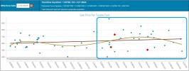
The dots in the red box that pull up the curve and the dots in the blue box that pull down the curve are not the same.
So what we have above in the red box represents the spring season, the most active time of year for real estate transactions. Then for the remainder of the year in the blue box, you see that the dots are towards the lower end of the range curing the line back down. It is generally fewer transactions during that time and the properties that trade around that time tend to be inferior to the properties that trade in the spring. That is why the dots are lower. The dots are lower because they are inferior properties, not because they are equivalent properties as the upper end of the range sales in the red box. Prices and values are not declining from the red box to the blue box.
Understanding that this is the cause for the shape of the curve and the change in median price data over the year is very important.
Why are you using that and not using sale prices?


